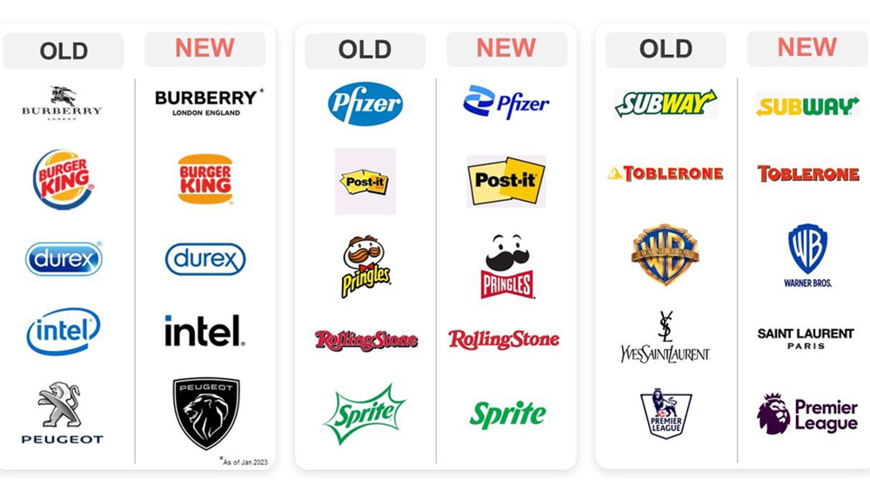
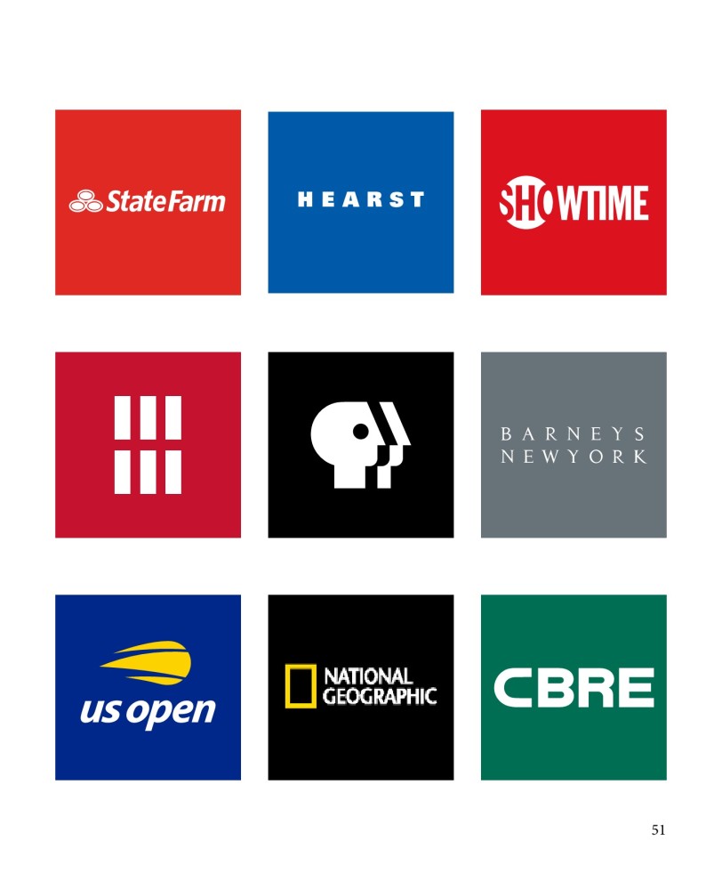
In a world saturated with visual noise, simplicity has become a powerful tool. This is especially evident in the realm of logo design, where the minimalist trend continues to reign supreme. Characterized by clean lines, open spaces, and a focus on core elements, minimalist logos have captured the hearts and minds of designers and consumers alike. But what exactly makes them so appealing?
The Power of Simplicity
Minimalist logos embody the philosophy of "less is more." By stripping away unnecessary elements, they create a sense of clarity and focus. This simplicity has several advantages:
- Memorability: Minimalist logos are easier to remember due to their clean and uncluttered design.
- Versatility: They can be easily adapted to various sizes and formats without losing their impact.
- Timelessness: Minimalist aesthetics tend to stand the test of time, ensuring your logo remains relevant for years to come.
- Modernity: Minimalism is often associated with innovation and forward-thinking, making it a popular choice for tech and startup companies.
Key Elements of Minimalist Logo Design
While minimalism is about restraint, it doesn't mean sacrificing creativity. Successful minimalist logos often incorporate these elements:
- Geometric shapes: Circles, squares, triangles, and other basic shapes can be combined to create striking and memorable designs.
- Limited color palette: Using one or two complementary colors can enhance the logo's impact and readability.
- Typography: A well-chosen typeface can convey a brand's personality and strengthen the overall design.
- Negative space: Utilizing empty space can add depth and meaning to a logo.
Examples of Iconic Minimalist Logos
To truly appreciate the power of minimalism, let's look at some famous examples:
- Apple: The iconic apple with a bite taken out is a perfect example of a minimalist logo that has become synonymous with its brand.
- Nike: The simple swoosh is instantly recognizable and represents speed, movement, and athleticism.
- Adidas: The three stripes are a classic example of using geometric shapes to create a strong brand identity.
- Fedex: The subtle arrow hidden between the letters E and X is a brilliant example of using negative space effectively.
Embracing the Minimalist Trend
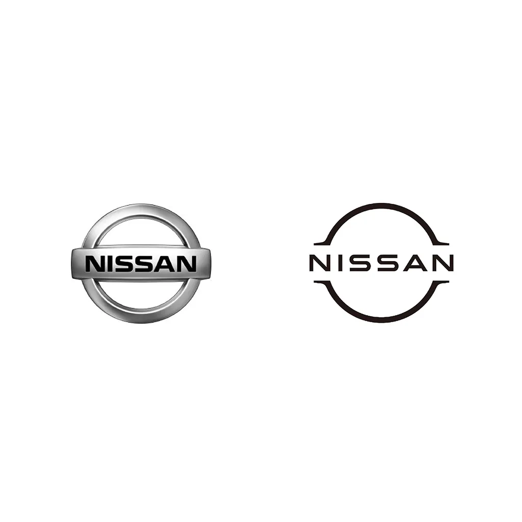
Whether you're a seasoned designer or a business owner looking for a new logo, minimalism offers a wealth of possibilities. By focusing on core elements and creating a clean, uncluttered design, you can create a logo that is both visually appealing and memorable.
Remember: While minimalism is a trend, it's also a timeless approach to design. By embracing simplicity, you can create a logo that will resonate with audiences for years to come.


