The Role of Color Theory in Graphic Design: Exploring Its Influence on Design Choices and Emotional Responses
Color theory is a fundamental aspect of graphic design that goes beyond mere aesthetics. It plays a crucial role in shaping the effectiveness of a design by influencing viewers' emotional responses and guiding their interactions with visual content. Understanding color theory helps designers make informed decisions that enhance communication, evoke desired feelings, and ensure visual harmony. This blog delves into the principles of color theory and explores how they impact design choices and emotional responses.
Understanding Color Theory
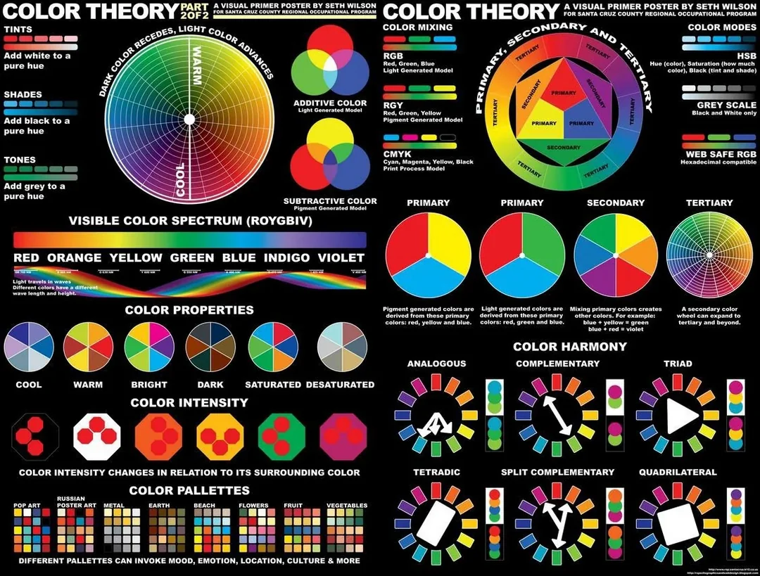
Color theory encompasses a set of principles used to understand how colors interact with each other and how they affect perception and emotion. It involves the study of color wheels, color harmonies, and the psychological impact of colors. Key concepts in color theory include:
- The Color Wheel: The color wheel is a visual representation of colors arranged in a circle, showing the relationships between primary, secondary, and tertiary colors. It helps designers understand how colors combine and contrast.
- Color Harmony: Color harmony refers to the aesthetically pleasing arrangement of colors that create a sense of balance and unity. Common color harmonies include complementary, analogous, triadic, and split-complementary schemes.
- Color Temperature: Colors are categorized as warm (reds, oranges, yellows) or cool (blues, greens, purples). Warm colors tend to be stimulating and energetic, while cool colors are calming and soothing.
- Color Psychology: Different colors evoke specific emotional responses and associations. For example, red can convey passion or urgency, while blue can evoke trust and tranquility.
The Impact of Color on Design Choices
1. Brand Identity and Recognition
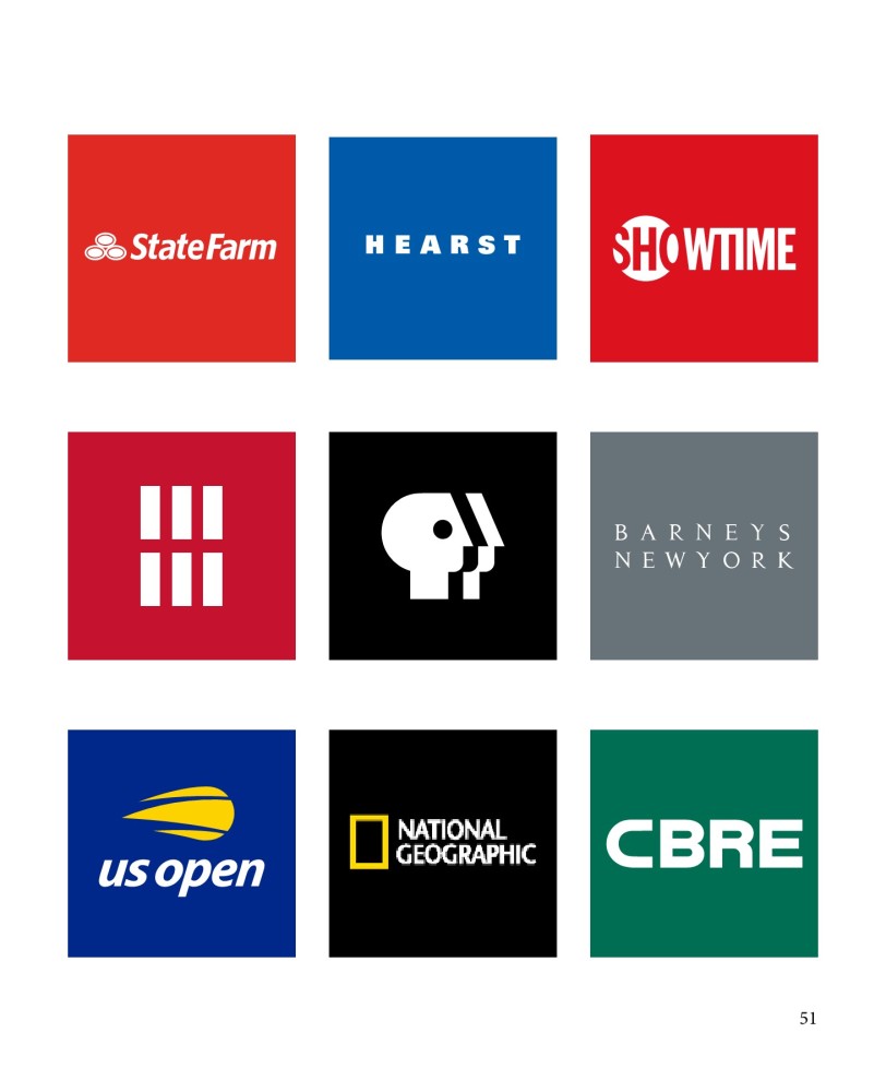
Color is a powerful tool in establishing and reinforcing brand identity. Brands often use specific color palettes to create a unique visual identity that distinguishes them from competitors. Consistent use of color in logos, marketing materials, and websites helps build brand recognition and trust. For instance, Coca-Cola's iconic red color is instantly associated with the brand's energetic and bold personality.
2. Emotional Engagement
Colors can evoke a wide range of emotions, influencing how viewers perceive and engage with a design. Designers use color to set the mood and tone of a design. For example, a calming color palette with soft blues and greens may be used for a wellness website, while vibrant yellows and oranges might be chosen for a children's toy advertisement.
3. User Experience and Readability
The choice of color can significantly impact the usability and readability of a design. High-contrast color combinations improve readability and accessibility, especially for text and call-to-action buttons. Designers must ensure that color choices align with accessibility standards to accommodate users with visual impairments.
4. Visual Hierarchy and Focus
Color is instrumental in creating visual hierarchy and directing viewers' attention to key elements. Designers use color contrast to highlight important information, such as headings, buttons, and calls to action. By strategically applying color, designers can guide viewers through a design and emphasize the most critical components.
Emotional Responses to Colors
1. Red: Often associated with excitement, passion, and urgency, red can grab attention and stimulate action. It is commonly used in marketing to create a sense of urgency or to highlight promotions.
2. Blue: Blue conveys trust, professionalism, and calmness. It is frequently used in corporate branding and healthcare to promote a sense of reliability and serenity.
3. Green: Green represents nature, growth, and health. It is often used in environmental and wellness designs to evoke a sense of balance and harmony.
4. Yellow: Yellow is associated with happiness, energy, and optimism. It can be used to create a cheerful and inviting atmosphere, but it should be used sparingly as excessive yellow can be overwhelming.
5. Purple: Purple signifies luxury, creativity, and sophistication. It is often used in designs related to high-end products or creative industries to convey a sense of elegance and originality.
Practical Applications of Color Theory in Graphic Design
1. Creating Color Palettes: Designers use color theory to create harmonious color palettes that reflect the brand's identity and purpose. By selecting colors that complement each other, designers can ensure visual cohesion and appeal.
2. Designing User Interfaces: In user interface (UI) design, color is used to enhance usability and guide user interactions. Effective use of color helps users navigate through interfaces and complete tasks efficiently.
3. Marketing and Advertising: Color theory plays a crucial role in designing marketing materials and advertisements. Designers use color to attract attention, convey messages, and influence consumer behavior.
4. Website Design: Color choices in website design affect user experience and engagement. Designers must consider factors such as color contrast, readability, and overall aesthetics to create visually appealing and functional websites.
Conclusion
Color theory is an indispensable tool in graphic design, influencing design choices and shaping emotional responses. By understanding the principles of color theory, designers can create visually compelling and emotionally resonant designs that effectively communicate messages and engage audiences. As color continues to play a pivotal role in design, mastering color theory allows designers to make informed decisions and craft designs that leave a lasting impact.


